What's new › Improved
Improved
Light mode across the whole app
Light mode now looks right everywhere, and grey text is easier to read.
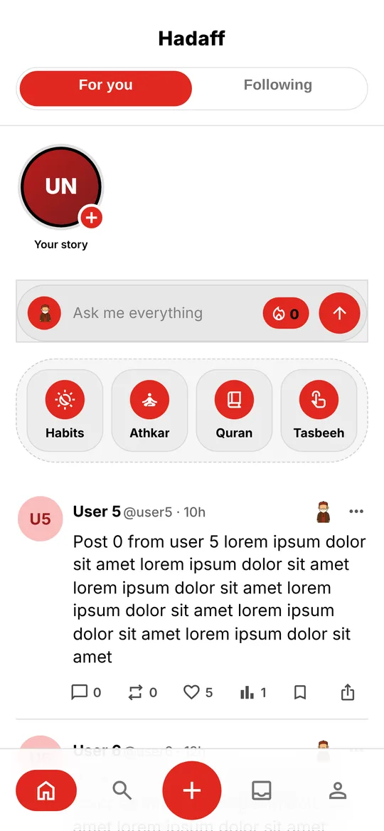
What changed:
- Every screen, sheet and viewer has a proper light version, from the ask bar and the composer to the photo and video viewer and your stats.
- Grey text and small labels have more contrast, in light and dark mode.
- Icons are black in light mode and white in dark mode.
- Buttons with only an icon now also have a name for screen readers.